Last updated December 8, 2020
If you work with Adobe InDesign every day, this blog post may not interest you, especially if you are part of the design gentry offended by a sentence that contains both “design” and “Microsoft Word.”
Ah yes, from the design perspetive, there is much to lament about MS Word. However we can still create good pages with MS Word . The principles of layout and typography remain the same, regardless of your medium or application.
Typography Animated Tutorial
Design with MS WORD
While it does not have the elegance and workhorse qualities of InDesign, MS Word can still be used to create well-designed pages. This word-processing application is still the most popular software for writing documents, and it is possible to design the look of the page if you use design principles and take time to learn the tools for paragraph formatting, character and paragraph styles, and other layout functions. The goal of this blog post is to persuade you that it is possible to design better pages in MS Word, but it will take some hunkering down to learn whys and wherefores and then to study how to use the tools available in Word. There are references at the end of this blog that can be helpful.

Are there design strategies that don’t work as well in Word? Yes, but since so many of us are using Word as our frequent go-to writing tool, why not use it to the peak of what it is capable of and get our words in Word to look better than what the default offers us?
We make many choices when starting to write in any application. Some of these are already determined for us when we create our document. To get out from under the “Automatic/Default” settings is how you can start creating better-designed pages, that is, pages that communicate the ideas you started with when you began to write.
The first automatic setting to change is the size of your text (font size) and the space between the lines of text (aka leading). When you create a new document in Microsoft Word, a font and font size are chosen for you.
Usually, the default font is Calibri or Times New Roman, and the default font size is either 11 or 12 point. One introduction to choosing fonts and font sizes can be found at https://venngage.com/blog/how-to-choose-fonts/.
Leading = Line Spacing
In typography, leading (pronounced ledding, rhymes with heading) refers to the distance between the baseline of one line of type and the baseline of the next line. The term comes from the days when typesetters placed by hand thin strips of lead into the presses to increase the vertical distance between lines of type.
The term “leading” is used in page-layout and other design software such as InDesign. In word processing software, it is usually called line spacing.
No to Automatic Line Spacing
For a good annotated image of what metal leading looks like, see James Felici’s photograph below where the strip of added lead is flagged in yellow. His article, Just Say “No” to Automatic Leading, is also an excellent explanation of why not to use the default leading (set at 120%) suggestion. Also, if my explanations here are not clear or you want more information, a quick reading of his article may clarify things for you.
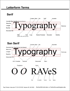
Leading is measured from baseline to baseline and expressed in points. Changing the leading affects appearance and readability. For example, lines of type jammed closely together or too far apart can be difficult to read, and typefaces with long ascenders and descenders generally read better with increased leading.
Step Back
If this is all sounding too technical, you might first read The PC (Mac) Is Not a Typewriter (4,5) by the well-known designer Robin Williams.
If you already know that two spaces no longer should follow a period, you could move right to The Non-Designer’s Design Book, (6). A PDF of the 2012 edition is available at the end of this blog post.
Changing Line Spacing
In these three different versions (leading too tight, just right, and too loose) of the same Robert Bringhurst quote,3 Robert Bringhurst, The Elements of Typographic Style, Version 3.2, 2005:19. you can see what a difference leading can make.
Line spacing in MS WORD
So, even if it is just a quick snail-mail thank you letter to your grandmother, consider paying attention to leading in order to improve readability of your message.
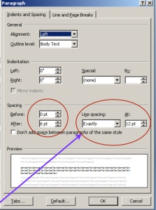
Sometimes the default will work fine. Other times, you may want manual control. To get manual control of line spacing in Word, go to the drop-down menu for Format > Paragraph > Indents and Spacing, and you will find the panel where you can control line spacing and other parameters.
If you are changing the leading for text already in the Word document, remember to select (highlight) all the text that you want changed.
Change the line spacing to “Exactly” and determine the point size for leading. A good start is to add 2 points to the font size. So if your font size is 11, set the “Line Spacing” at 13 or 14 points.
The dialogue boxes for “Spacing” indicate how much white space will be “Before” the paragraph and how much space “After.” A good start for paragraphs set at 11 points and not indented is to enter zero for “Before” the start of the paragraph and 6 points for “After” the paragraph.
If you are indenting paragraphs, you may want to also set “After” to zero.
Your Typography Choices
Your choice of typeface family, letter spacing, text alignment, background color, text color, line length, and written copy—all of these choices will affect the line spacing requirements. While you can find mathematical rules to follow (typesetters, printers, and writers have been looking at these issues since before the 1400s and Gutenberg’s press), setting good line spacing (the best for readability) is a matter of aesthetic judgement and personal reading preferences, based on who our potential readers will be as well as history: what we know about how people of different times, cultures, and alphabets read texts.
Posters & Flyers
Sources
- Cutherell, Josh. “Six Things You Didn’t Know Word Could Do: Design and Microsoft Word Part 1,” Open Box 9.com, April 17, 2015, accessed August 29, 2020, https://openbox9.com/2015/04/17/design-and-microsoft-word-1/.
- Felici, James. “Just Say No to Automatic Leading.” Creative Pro.com (blog), February 3, 2010, accessed August 29,2020, http://creativepro.com/just-say-no-automatic-leading/.
- Bringhurst, Robert. The Elements of Typographic Style. Version 3.2. Vancouver, BC: Hartley & Marks, 2005: 19.
Other Resources
- Craig, James. Basic Typography: A Design Manual. Formerly Phototypesetting: A Design Manual. NY: Watson-Guptill, 1990.
- Craig, James and Irene Korol Scala. Designing with Type: A Basic Course in Typography (5th ed). NY: Watson-Guptill, 2006.
- Cutherell, Josh. “When Not to Use Word : Design and Microsoft Word Part 2. ” Open Box 9.com, July 10, 2015, accessed August 29,2020. https://openbox9.com/2015/07/10/design-and-microsoft-word-2/ 7/10/2015.
- Haley, Alex. “Point Size Is Different from X-Height.” Fontology (blog) at Fonts.com (n.d.) accessed April 26, 2015. http://www.fonts.com/content/learning/fontology/level-1/type-anatomy/x-height.
- Lynch, Lyndsay. “How I Came to Love the En Space.” The Atlantic, September 9, 2016, accessed 8/29/2020. https://www.theatlantic.com/technology/archive/2016/09/how-i-came-to-love-the-en-space/499337/.
- Williams, Robin. The Non-Designer’s Design Book. 4th edition. CA: Peachpit Press, 2014.
- ________________. The Mac is Not a Typewriter, 2nd edition. CA: Peachpit Press, 2003.
- ________________. The PC is Not a Typewriter: A style manual for creating professional-level type on your personal computer. CA: Peachpit Press, 1992.
PDFs to Download
© Barbara Kristaponis 2014-2022. The Good Page.


Carol, For more detailed instructions for line spacing in MS Word, you could try : https://support.office.com/en-in/article/Change-the-line-spacing-615b5334-d7cb-4c8c-9a4b-1b771ecf4f8b and other on-line tutorials. There are a lot of excellent step-by-step instructions online but be sure to check the version. If your version of MS Office is older than 2010, be sure to google for that version as there were major changes once the “ribbon” was introduced. Hope this is helpful.
LikeLike
i wanted to get into the practical details and explanations of what to do rather than details about typesetting. perhaps if that part came later after i read about how to go about changes and what the effect would be…in general the instructions seemed glossed over and the typography information emphasized–suspect this is what interests you more…
LikeLike