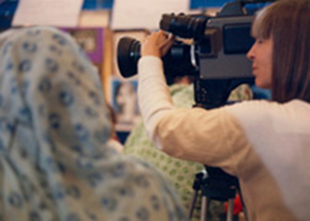
For most of my earn-a-living life (20+ years) I was a camerawoman, video editor, video artist, and television instructor.
After an unpredictable event that affected
my balance, I moved to writing, editing,
and graphic design.
In this work as a medical editor, editorial director, and grant writer for teams at Memorial Sloan Kettering, Mt. Sinai Medical Center, the New York Hall of Science, and other organizations, the deadlines were so always-pending and the stakeholders so always nervous that the basic design of the page was something we did quickly as best we could. Not many people wanted the writing to do more than get the money in. But we knew that the quality of the writing, accuracy of the data, and how it looked on the page mattered.
I always wanted the writing to do more, and part of that more—the good page—has to do with how the page looks. This includes the layout of elements, choice of photographs, color palette, typography …
For those who write for a living and often only have a little time to think about the layout and typography of a page, this site is a place to drop in and pick up a few things to think about, with resources and other people to search out. I am only the tracker to a longer road of wonderful stuff in the design world today to look at and to read.
I started this site in 2014 after four years of teaching a workshop in basic design for medical writers at the annual conferences for the American Medical Writers Association. I started studying graphic design in the late 1990s at Parsons and School of Visual Arts and have never stopped.
About this site
What other people find beautiful
I often do not, and
what I have found beautiful,
others often do not.
There is a line from Jane Bowles’ play The Jumping Bean that resonates with me on this note: Gabriel has asked Beryl Jane to tell him what things she thinks are beautiful. When she mentions snakes, he is baffled, and she says, “You mean what beautiful things do I love that the world loves.”1 Bowles, Jane. “At the Jumping Bean.” Feminine Wiles, 1976:47
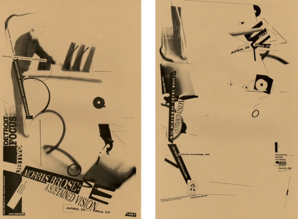
So often in these articles/posts where I am presenting various graphic design principles and page layout guidelines (things from the history of what the world has found beautiful), I also include my own preferences for things off-the-beaten track of classical design practices. My favorite example is the work of Edward Fella, a contemporary master of hand-drawn typography.
Design writer Rick Poynor: “Ed Fella should take his place in the canon as a designer-artist who has fused his mastery of both disciplines to make an exceptional contribution to the development and future potential of word-based visual art.”2Ed Fella: A Life in Images

- Bowles, Jane. “At the Jumping Bean.” Feminine Wiles. Santa Barbara: Black Sparrow Press, 1976:47.
- Ed Fella: A Life in Images. Short video preview for Kickstarter book campaign with examples of Fella’s work and story, 2020.
© Barbara Kristaponis 2014-2026. The Good Page.
