
Last updated December 8, 2020
One afternoon at a conference for medical writers and editors, we were 21 people participating in a workshop on page layout. Our task was to look at what makes a “good page.”
Writing systems vary, but a good page is not hard to recognize, whether it comes from Tang Dynasty China, the Egyptian New Kingdom or Renaissance Italy.
The principles that unite these different schools of design are based on the structure and scale of the human body—the eye, the hand, and the forearm in particular—and on the invisible but no less real, no less demanding and no less sensuous anatomy of the human mind.
Robert Bringhurst1The Elements of Typographic Style, version 3.2, 2008:10.
Memory in Disguise
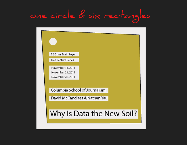
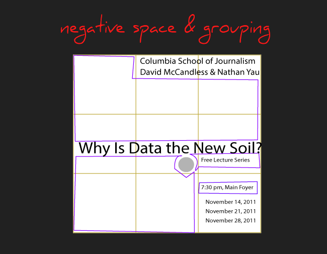
Before showing examples of page layouts based on grid systems, I gave each person six or seven shapes (one circle and some oddly rectangular shapes) of colored paper and one sheet of paper with a grid of nine squares.
The only direction was to place these colored shapes in some arrangement on the grid in a way that worked for the arranger. We were going to think about how a “page” looks, irrespective of any word content and to see if it was obvious—those principles of design that according to Bringhurst cut across cultures and generations.
Instinct, in matters such as these, is largely memory in disguise. It works quite well when trained, and poorly otherwise.
But in a craft like typography, no matter how perfectly honed one’s instincts are, it is useful to be able to calculate answers exactly. History, natural science, geometry and mathematics are all relevant to typography in this regard—and can all be counted on for aid.
Robert Bringhurst2The Elements of Typographic Style, version 3.2, 2008:143.

Although more than a few participants had said they had no visual talent, and only one admitted to some formal design training, when we put all the grids up on the wall, almost every grid layout was appealing and interesting in some way.
There were a lot of “good pages” there. How did this happen? Intuition? Gut instinct about where to place a shape? Tradition? Did we all agree on what made a page “good” or not? Were there some grids that some believed should not make it into the “good page” category at all? And if so, what was it about them that got them relegated to the ‘not-a-good-page’ pile?
Defining a “good page” for us became less like a biochemist’s pursuit of a new vaccine and more like a knight’s quest, where the knight gets sidetracked and forgets the quest with the discovery of new wonderful things, equally as desirable as the original sought-for object. It was clear also that different people had different preferences for good page layouts.

Does this mean a “good page” is subjective? And that my “good page” may not be your “good page”? Or are there rules one could follow that would help us to recognize, appreciate, and create good (or better) pages? Words like focal point, alignment, balance, and dynamic tension come to mind.
What is a Page?
We are still in the realm of no words yet on the page. A “page” used to mean one side of a sheet of paper in a collection of sheets, sometimes bound together in a book, magazine, or newspaper. However, today a “page” could be a screen rectangle, as in the “home page” or other “pages” of a website.
Today we consider a “page” to be any surface upon which one could write, draw, or project an image—a cave wall, a window pane, a quilt, a television screen.

On these various “pages” we eyeball a lot of images (and words) today—ads in our magazines, animated billboards, store displays, fashionista outfits walking by. And what we see around us does influence us, whether to copy or reject or build upon.
In creating a good page from scratch (book cover, resume first page, annual report page, graffiti wall, etc.), we can use intuition. We can use what we have seen and liked. We can also use math.

A grid is a simple mathematical tool for organizing space, words, images, and other elements placed on a page. A page divided into columns and rows (one type of grid) is a way to organize information so that one can determine how to place elements that carry the message we want.
The page-grid ideas used today by many designers originate in older systems of aesthetics based on math and physics and can get beautifully complicated. See the Fibonacci Sequence (also known as the Golden Mean, Golden Ratio, Fibonacci Spiral, and the Greek Letter Phi) for some history.

Typography is not only verbal information but also lines of texture within a composition. These textures create rectangles of tone on the page and the relationship of the positions of these rectangles is critical to the perception of order and unity within a composition.
The duality of the two roles gives the designer responsibility for both communication and composition.
Kimberly Elam5Grid Systems: Principles of Organizing Type, 2004:5.
Grid Training by Kimberly Elam
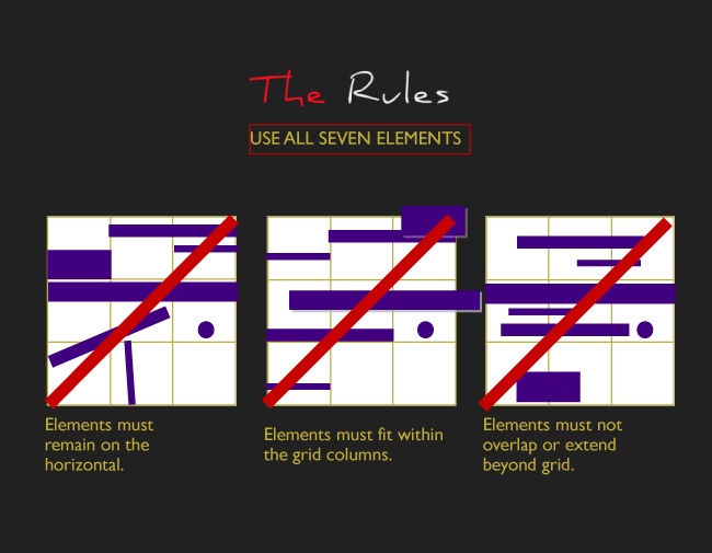
The grid exercise described in the first paragraphs of this post is a looser version of the basic exercise (with various levels of restrictions) that Kimberly Elam develops in her book (course) on the grid and graphic design, Grid Systems, from which the quote above is taken. (3) The red rectangles represent blocks of text and the circle is a wild card.
Spend time deep-reading through one of her exercise assignments and solutions; you may never look at text-in-a-square quite the same way again. The book is dense, worth studying, worth going back to again and again. See the video flipbook below for a look at the pages to get an idea of the course on grid-design she leads her readers through.

Even a quick look through her examples of how designers have used the grid in unpredictable ways can prove enlightening no matter your level of grid-design skill.

All this is not to say that in order to lay out a good page, one must follow a grid structure. Many cultures and present-day designers do not use grids in shaping their pages, and those pages would still make it into the halls of the good-page archives. But grids are a useful tool to understand and use.
Sources
- Bringhurst, Robert. The Elements of Typographic Style. BC: Hartley & Marks. 2008: 10.
- Bringhurst, Robert. The Elements of Typographic Style. BC: Hartley & Marks. 2008: 143.
- The Beatus of Facundus (1047). “In the 8th century, in a monastery in northern Spain, 700 years after the Book of Revelation was written, a monk named Beatus illustrated a collection of writings he had compiled about this most vivid and apocalyptic of the New Testament books. Throughout the next few centuries his depictions of multi-headed beasts, decapitated sinners, and trumpet blowing angels, would be copied over and over again in various versions of the manuscript.” John Williams, author of The Illustrated Beatus, explores more in his article for The Public Domain Review, “Beatus of Liébana.” accessed September 4, 2020, https://publicdomainreview.org/collection/the-beatus-of-facundus-1047. More images from this manuscript can also be found there.
- Archeological pre-historic human cliff drawing over 4000 years ago, Nakhonratchasima, Thailand, iStockPhoto, 2010.
- Elam, Kimberly. Grid Systems: Principles of Organizing Type. NY: Princeton Architectural Press. 2004: 5.
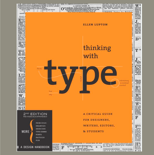
- Lupton, Ellen. Thinking with Type: A Critical Guide for Designers, Writers, Editors, & Students.NY: Princeton Architectural Press. 2004: 143.


Resources
- Bringhurst, Robert. The Elements of Typographic Style. Vancouver: Hartley & Marks. 2008.
- Elam, Kimberly. Grid Systems: Principles of Organizing Type. NY: Princeton Architectural Press, 2004.
- Bringhurst, Robert. Typographic Systems. NY: Princeton Architectural Press, 2007.
- Lupton, Ellen. “Grid.” Thinking with Type, 2009, accessed September 4, 2020, http://thinkingwithtype.com/grid/.
- Samara Timothy. Making and Breaking the Grid: A Graphic Design Layout Workshop. MA: Rockport Publishers, 2002.
© Barbara Kristaponis 2014-2026. The Good Page.
