
updated February 13, 2021
When grapefruits were 5 cents and oranges a penny, grocers hand printed their own signs and they did well. They just wrote: “APPLES DELICIOUS 4 LB 25¢” and they sold apples.
Union Leader, 7-Up, Beech Nut, Copenhagen Cigars, and Model Tobacco (the advertisers) thought these hand printed letterforms in paint on the windows were just fine, even though the advertisers had their own official signs and advertising typeset by printers.
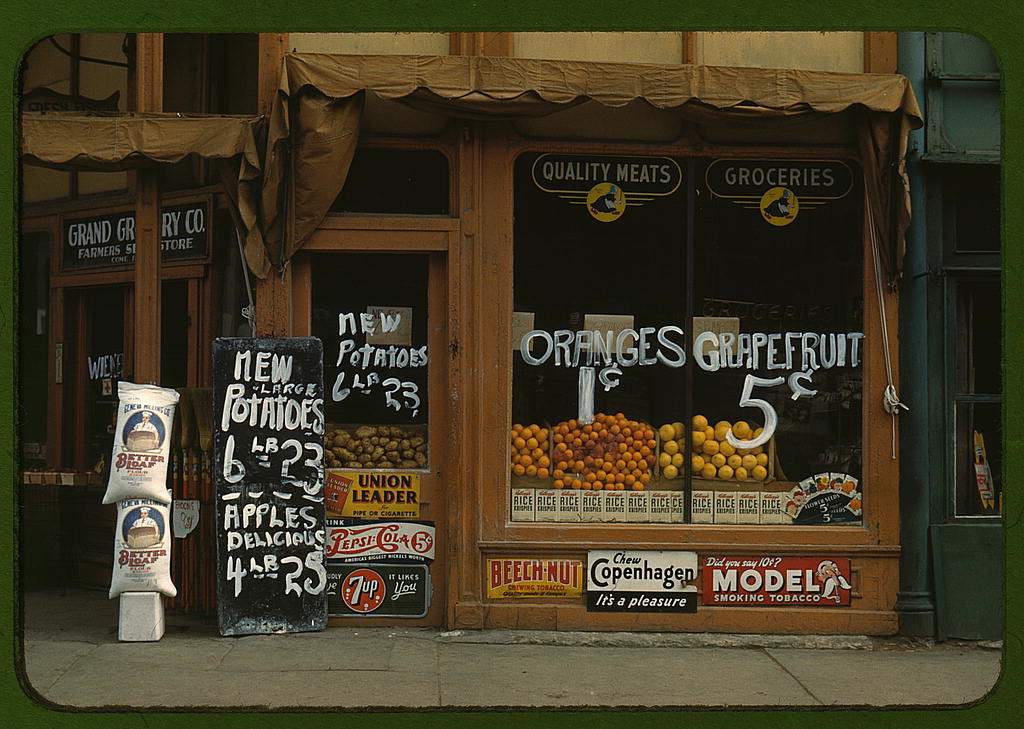
In this Lincoln, Nebraska photo from 1942, the handwritten “A” appears five times, similar each time but not exactly the same, but the shoppers knew this was an “a” regardless of the slight variations.
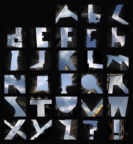
Letterforms are the graphic representation of letters of the alphabet (including punctuation and other symbols), either as hand written or in a particular typeface. Whether typeset by a printer or handwritten by a grocer, letterforms are recognizable to citizens of the same culture, e.g., Westerners can identify the letters of the Latin alphabet (with or without diacritical marks), Russians, the Cyrillic alphabet, etc. The letterforms below were formed by the tops of buildings and the sky.2

A typeface is a design for a set of characters (letterforms). Each character is also called a glyph. The glyphs of a typeface include the letters of the alphabet, numbers, punctuation marks, and symbols. Frequently used typefaces today are Times Roman and Arial, to name only two. The typeface represents one aspect of a font: the font also includes digital perimeters for use on screens and other digital devices.
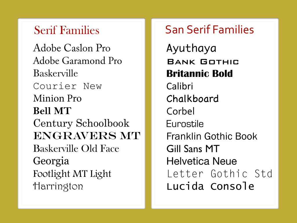
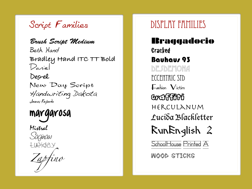
There are two general categories of typeface families (classifications): serif and sans serif. Serif typefaces have flourishes (cross-lines or decorative marks) at the ends of the letter strokes. These typefaces were based on early calligraphy and stonecutter lettering. Times Roman, Garamond, Caslon, and Minion Pro are examples of serif typefaces. Sans serif typefaces do not have these flourishes. Helvetica, Arial, Verdana, and Corbel are examples of sans serif typefaces.

Many designers also separate out Script Typefaces and Display Typefaces as separate classifications. Script typefaces such as Beth Hand and Daniel are based generally on handwriting and are used most often for things like wedding invitations or diploma documents. Display typefaces such as Fashion Victim and Braggadocio are generally too hard to read when used as body text, but serve to focus attention in headlines and poster titles.

Family of Typefaces
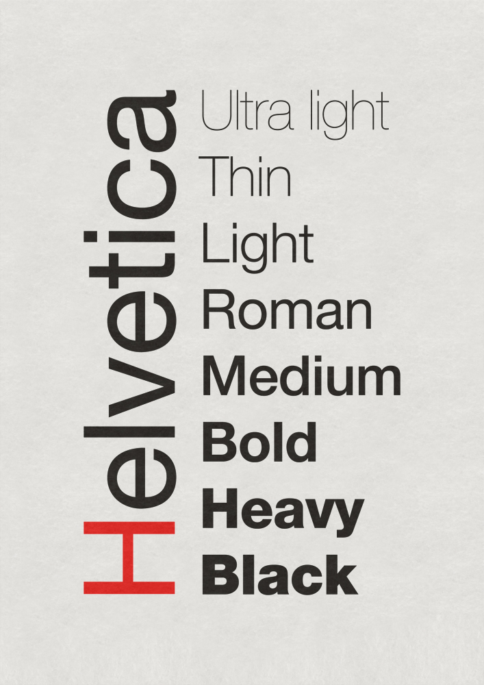
A typeface for text such as Helvetica is actually a family of typefaces composed of the typefaces Helvetica Medium, Helvetica Italic, Helvetica Bold, etc. Most typeface families are composed of a Regular (used for body text), an Italic (used for emphasis), and a Bold (also used for emphasis).
Typeface vs. Font
Although the terms “typeface” and “font” are used interchangeably today, they are not strictly speaking the same thing. After a typeface is designed to work in print, type designers today then create the digital paradigms so that the typeface can be used in digital form, i.e., in bytes
The skill involved in creating beautiful typefaces that allow comprehension of words can be compared to fiddle and violin makers, skill levels and sound levels and aesthetic levels vary with skill and love of the task. And even though there are thousands of beautiful typefaces in use today, still there are those, especially large corporations or foundations, that want a typeface designed especially for them.
Doyald Young is one of those designers celebrated for the individual typefaces he has designed for specific businesses and institutions that have requested them. His love of this work and some indication of the skill involved can be seen in the film on Lynda.com listed below.
In addition to understanding the basic difference between serif and sans serif typefaces, another useful thing to know is the parts of a letter.
Often when we design a page, we need to be mindful not only of the size of the font (9 points vs. 14 points), we need to pay attention to the spacing between the lines (called line height or leading). Baseline, x-height, ascender, descender: these are a few things to know that can help in making those lines-on-the-page decisions.

Parts of a Western Glyph

Doyland Young
To learn to draw a letter well takes a lot of time. I’ve been drawing letters since 1948. And I’m still learning how to draw. Jan Van Krimpen, one of my great heroes, he says, “I do not want to draw a beautiful letter. I want to draw a good letter.” Now I think that good letters are beautiful.
I love to draw letters. I found out that I did. It pleased me. I think it goes back to basic personality. For instance I have a love of detail. Despite the fact I call myself a logotype designer teacher, I’m delighted to say that my life revolves around typography. It permeates our lives, it permeates our culture. Our history is written in typography.
And it’s just something I love to do. I’m happiest when I’m at the board with a pencil.
Doyald Young 4 Creative Inspirations: Doyald Young, Logotype Designer, Lynda dot com (LinkedInLearning).

Sources
- Vachon, John F, Photographer. Grand Grocery in Lincoln, Nebraska. Farm Security Administration and U.S. Office of War Information. https://commons.wikimedia.org/wiki/File:Lincoln_Nebraska_grocery.jpg.
- Mhatre, Pratik, Study Director for the National Study of Learning Mindsets at the Population Research Center, College of Liberal, The University of Texas at Austin.
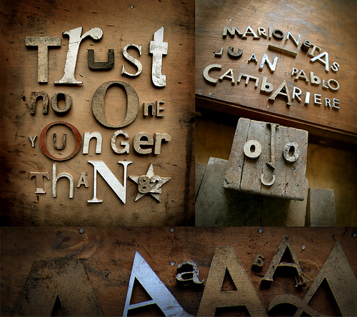
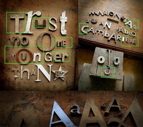
- Cambariere, Juan Pablo, Sculptor, Designer, Buenos Aires, Argentina. Images used with personal permission of sculptor.
- Young, Doyland. “Creative Inspirations: Doyald Young, Logotype Designer.” Lynda.com (LinkedInLearning), accessed September 7, 2020, https://www.lynda.com/Documentaries-tutorials/doyaldyounglogotypedesigner/62371-2.html.
- Jaramillo, Brian. “Doyland Young: His body of work is so elegant, so distinctive so perfect, that it transcends logo design, transcends the craft of making letters, and rises to a higher place, a place where letters dance with art.” Letter Cult: Custom Letters &c (blog). September 25, 2008, accessed 8.31/2020, http://www.lettercult.com/archives/.
© Barbara Kristaponis 2014-2026. The Good Page.

For more on the debate between serif and sans serif OR when to use serif and when to use sans serif, see http://www.webdesignerdepot.com/2013/03/serif-vs-sans-the-final-battle/, http://designshack.net/articles/typography/serif-vs-sans-serif-fonts-is-one-really-better-than-the-other/, and http://alexpoole.info/blog/which-are-more-legible-serif-or-sans-serif-typefaces/. This debate has been running a long long time, and as cognitive reading psychologists and neuronscientists study such things, we will no doubt learn more about ease of reading text and typefaces.
I’m still on the crusade to remind people that sans serif is hard to read. David Ogilvy reported that readers tire and don’t get to the end of the copy. He confessed that he simply throws sans serif material in the round file.