
updated February 6, 2021
This article is an introduction to alignment typesetting and an encouragement to look at the details of alignment choices out in the world. Regarding text alignment, there is left-aligned, centered, right-aligned, and justified text.
In left-aligned text, the words are in rows one below the other on the left side of the page, and the right side of the text is uneven. This unevenness of non-aligned text is called a “rag.” Left-aligned text is also called “flush left” and its rag is “ragged right” or “rag right.” In right-aligned text, the words line up on the right side and the left side is uneven. Right-aligned text is also called “flush right” and its rag is “ragged left” or “rag left.” In center alignment, the text is equidistant from a center point. Center-aligned text is often seen in wedding invitations and other formal announcement. In justified text, all the lines of type are the same length, so text on both the left side and right side are aligned.
In the West, most documents we write (type) today are left aligned, and we let our software take care of the rag. Word spacing and letter spacing are done automatically for optimal readability, no matter our software—Adobe InDesign, Quark, MS Word, or other writing software application.
You can chose basic alignment settings in word processing applications, and there are more alignment options in layout applications such as InDesign.

Text Alignment & White Space
Although most of your work will be with left-aligned text, there are times when a right-aligned block of text can serve you well. For example, when an image is placed on the right side of a page, right-aligned type anchors text and image. In the first example below, there is a gap between the text and the image, leading to “trapped white space.” In the second example, the text is right-aligned, freeing up the white space and connecting type to image.

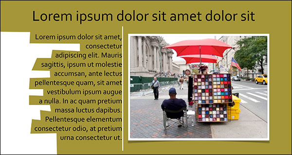
There are also times when right-aligned text balances an image on the left or adds a dynamic alternative to the predictability of left-aligned text.

Just Hit the Justify Button?
Justified text is what we are used to seeing in our newspapers, novels, and text books. However, these printed materials have been typeset by printers or designers, and there is skill involved. Yes, a quickie justify—just hit the justify button—is possible, even in MS Word, and sometimes this will look just fine. However, automatic justification can result in some problems for your readers. See the three versions of justified text below of the quote from Designing with Type by James Craig and William Bevington, page 99.

Problem #1: You can end up with words and letters too tightly packed together resulting in text that is hard to read.
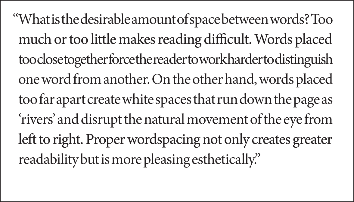
Problem #2: You can end up with distracting variations in word spacing or letter spacing or “rivers” of white space making distracting columns running through the text, which can make for ugly and difficult-to-read pages.
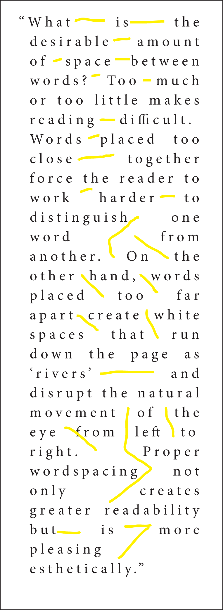
Rivers in Text
Rivers are more likely to happen when you do not allow text to be hyphenated, when the line length produces a narrow column, and when word spacing (tracking) and letter spacing (kerning) are not adjusted. For more examples, google rivers in justified text.
Adobe InDesign
For those working with Adobe InDesign who want to know how to create well-justified text in long documents, see Designing a Book by Nigel French on Lynda.com. The entire video book course (4–5 hours) is well worth the time spent.
The three most relevant course sections to this post are (1) Chapter 3: Creating and Applying Paragraph Styles, (2) Chapter 4: Styling the Text, and (3) Chapter 6: Finessing the Text.
Proper justified type takes time to master, but it is worth the effort to learn more about word spacing, letter spacing, orphans, widows, and other type elements if you want to craft beautiful readable typography.
Manual word-spacing
Before I spent time learning from Nigel French how to set justification parameters within Adobe InDesign, I never used justified text for long documents. I had seen too many bad examples of sloppy justified text. I would, however, justify short paragraphs of text, but this could be time-consuming. In what was an agonizingly slow process, I have manually changed word spacing, font size, and letter spacing, and sometimes word choice for each line of text to get typography that worked. All to prevent the rivers or distracting white space between words. See the HPV poster below.
In the HPV poster below (created in Adobe Illustrator), the justified text was done manually by changing the length of the lines, color, font size, word choice, letter-spacing (kerning), and word-spacing (tracking) to eliminate rivers and wide gaps between words.

Resources
- Craig, James and William Bevington. Designing with Type: A Basic Course in Typography (4th ed). NY: Watson-Guptil, 1999.
- Dowding, Geoffrey. Finer Points in the Spacing & Arrangement of Type (Revised ed.). Vancouver, BC: Hartley & Marks Publishers. 1998. “Experienced designers, be forewarned; Dowding is unavoidably influential in this tome – the result of his lifetime of experience in the typographic arts. At the same time, he cannot escape that experience… illustrating with examples, Dowding discusses typographical layout solutions which often suffer from lack of attention to detail, then provides corrected versions for comparison. This method combined with a concise writing style and his authoritative voice, will undoubtedly heighten your typo-senses. He is an unabashed traditionalist, a master of the craft.” Review accessed at Mantex Information Design (Finer Points in the Spacing and Arrangement of Type), accessed September 27, 2020.
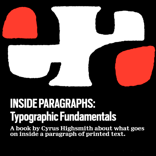
- Highsmith, Cyrus, Inside Paragraphs Typographic Fundamentals. Boston, MA: Font Bureau, 2012.
- Middendorp, Jan. Shaping Text: Type, Typography and the Reader. Amsterdam, NL: BIS Publishers, 2011.
- Samara, Timonthy. Typography Workbook. Rockport, ME: Rockport Publishers, 2004.
- Strizver, Ilene. “Justified Type.” Fontology Level 2: Practical Typography (blog), Fonts.com, accessed September 7, 2020, https://www.fonts.com/content/learning/fontology/level-2/text-typography/justified-type.
Typography Animated Tutorial
Technical Resource Notes
- Lynda.com, (now LinkedInLearning). is a great online resource for learning about graphic design and typography, whether you are interested in learning the principles of design or honing your technical skills in various applications, including Adobe InDesign and MS Word.
- While this is a subscription service, there are often free courses. Often they offer a free month trial subscription where all the video courses are available to you. If you live in the United States or Canada, you may have free access through your public library. Also many university libraries also can provide free access if you are a student, instructor, or researcher with that university.
Tracking, Kerning & Kerning Pairs
- Section on Kerning and Kerning Pairs in Ina Saltz’s Lynda.com course Graphic Design Foundations: Typography.
- Section on Tracking and Kerning in Nigel French’s Lynda.com course InDesign: Typography 1.
© Barbara Kristaponis 2014-2026. The Good Page.

Barbara, I enjoyed this posting and appreciate your recommendations for resources for typography. I noticed that you mentioned center-aligned text but did not say much about it. In my opinion, there is almost never a good reason to center-align text in a technical document. Do you have thoughts on this matter?
Center-aligned text can work so well for many things (posters, business stationary, and wedding invitations), but in technical documents, other than in quotations, pull-quotes, and table heads, centered text is probably not too useful. However, I would love to see a tech paper out there where center-align was used beautifully.
If I ever see one, I’ll send it to you.
BTW, I can’t agree with you about any of the uses you mention. In particular, center-aligned text in a table column works against the purpose of columns, in my opinion, and that includes the column headings (which is what I think you mean by “table heads”).
The illustrations of your text made it very understandable.