Last updated December 8, 2020
Graphic design is what we do to words so that they can be read on a page, the means by which words, images, shapes, and symbols convey meaning. By hand-lettering our thoughts or choosing a typeface, we put words on a surface.
Readability (the accessibility of the text) is at stake here. The design of the page, in addition to the actual words, determines how easily a passage may be read or understood.
Readability & Legibility
By grouping like things together, nuggets of content are made. Writers habitually indent paragraphs, capitalize words, place commas, underline phrases, give titles special treatment, and italicize quotations—all elements of graphic design. How words are arranged on a page determines the legibility and readability of the text. Legibility refers to how easy it is for the reader to distinguish the letters from one another. Readability refers to the choice of words and typography so that the written content flows in a simple, easy to read manner. The placement and visual attributes (typeface, color, size) of these words determine whether a reader will be attracted to the page at all.
For an excellent introduction to how and why to design for readability, see Santa Maria Jason’s “How We Read” (Chapter 1 of his book On Web Typography published by A List Apart).
The “page” could be analogue or digital: housed in a Microsoft WORD document, Excel spreadsheet, tablet screen, email, e-book, or LinkedIn post, a painted page from an illuminated manuscript, a hand-written letter, or a graffiti-painted subway car.
Painted Pages

In the Middle Ages, monks used gold leaf, color, patterns, and detailed images to create pages of beauty in illuminated manuscripts that would attract their readers, mainly at first, other monks who were studying the sacred texts. The images served another purpose: listeners who could not read would have something to look at as the monk read the text to them.
Images & Memory
Since these stories contained the essence of a culture/religion and descriptions of how to live a good life, it was important that these stories be remembered, repeated, and widely known. The images helped them remember the plot, characters, and messages of the narratives and lessons.
The image above is the inner-board page from the Gondarine Sensul, an illuminated manuscript made in the Gondarine region of Ethiopia in the 17th century.2 This accordion book was created from a single folded strip of parchment, attached to heavy leather “boards” at each end. The original pocket-size book is now in the archives of the Walters Museum of Art in Baltimore.
As writers, we may need to create a poster that will attract readers, craft an annual report that will get a deep read instead of a quick scan, formulate an agenda that people will actually read before a meeting, or write an email that will get a prompt response. To heighten the chance that our words will be understood, these elements of graphic design can be good to know for creating business letters, memos, agendas, blogs, progress reports, evaluations, Web pages, résumés, informational graphics, research posters, patient brochures, slide decks, and long documents to heighten the chance that our words will be given the attention they deserve—that people will read them and not just scan them.
Like the fundamentals of music, the design principles are what one learns at the beginning of design practice and then can spend a lifetime working with—studying with great mentors and experimenting along the way. The basic design principles are the same for novice and expert designers, and writers can use them.
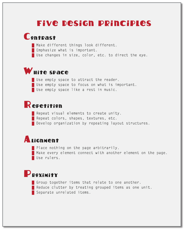
Five Design Rules
These five design principles are basically a condensed version of Robin Williams’ four well-known rules (as described in her book The Non-Designers Design Book)2Robin Williams, The Non-Designers Design Book, Peachpit Press, 1998, 2008, 2012, 2014. plus one . Her basic four rules are contrast, repetition, alignment, and proximity. I have added here white space. Consider getting the book. There are to date four editions and many are available at online thrift stores.
Contrast
Contrast is about comparison, one element noticeably different from another, and it is one of the best ways to attract readers to the page and create a visual hierarchy of various text elements. There are many ways to create contrast. One can use large type and small type, a bright color and a neutral color, large blocks of text and small blocks of text, large photo and small photo, densely packed lines and widely spaced lines, a decorative typeface and a standard typeface, all caps and sentence case.
The key to effective contrast is to make the elements VERY different. To have contrast on your page, make elements very different, not just a little different. Make one element bigger, brighter, darker, or bolder than another. Subtle differences do not often work, for example, 12-point text combined with 10-point text. Make that 18-point text with 10-point text.
White Space
Like water for fish, “white space” in design is that element of the layout that is generally not noticed. That part of the page not marked by text, images, lines, or shapes, it is also called “negative space” and refers to that part of a page left blank, left empty.

Writing is a visual thing. We see words. But we also see the spaces between the words, and it is in the placing of letterforms and white space that we achieve meaning in the mind of the reader.
Negative spaces on pages function much like the rests in musical notation, which are as important as the notes themselves. The white space between individual words (word space) allows us to read the sentence and not have to decipher this: THEREISNOwhitespacebetweenwordsHERE.
White space can be literally white, or, as early rough drafts of the book cover (Organize Your Workspace) shown below, not white, but light grey. The first row below shows the text needed on the cover. The second row emphasizes the shapes of negative space. Each of the three book cover versions could be said to contain just one “piece” of negative space, not counting the confined spaces within the letters O, R, A, and P. Of the three different shapes of negative space, the first draws attention to the center and appears more “organized” than the second.

The second example could be distracting as the two words in black could appear to be moving away from the center, and if those two words were placed closer to the top and bottom edges of the page, it could look like they are out of control and about to fall off the page. Since the book is about organization and order, this may not be what you want in the mind of your potential reader.
The third example of negative space has the less predictable and possibly more interesting and dynamic shape. However, there is something slightly off-balance about the whole design so it might require more work to both keep the interesting negative shape and also achieve a balanced look to the page.
Repetition
Our eyes like patterns and rhythms, which create unity and add visual appeal. Repeated visual elements—a line, a logo, a color, a typeface—all of these are pleasing to us on a page and provide consistency in multi-page documents. Bold headings, numbers lists, and quotations in italics are repetitive visual elements used daily by many writers.
In the list of Five Design Principles shown here, I used the same amount of white space between each category, the same red color for letters and bullets, and the same indent spacing of all bullets, and also used left alignment of all elements except the title. However, what a relief that the line lengths are different.
Otherwise, all this visual consistency could become annoying. However, the repeated elements order the parts and make it easy to see the parallel structure and main ideas. Understanding this design principle can be especially useful at a time when we are all streamlining our texts for blogs, emails, tweets, and web pages. Repetition of design elements can help eliminate unnecessary words by relying upon structure to convey some of the meaning.
Use repetition in a layout to draw readers to your text, speed comprehension, and provide unity for an entire document or project. For example, use the same color scheme and typeface for business card, stationery letterhead, web page, and annual report, which will go a long way toward establishing an integrated and positive business identity.
Alignment
Alignment is about providing a sense of order to your page when you want that, as opposed to the design-equivalent of the messy-desk effect, ie, old coffee cups, newspapers, open books, sticky notes, and pens scattered around. Giving each item a visual relationship with something else (aligning every element to at least one other element) will help provide strength, visual pleasure, and logic to a page. Aligned items are attractive to the eye and help the reader to navigate though the text. Align what you can and with intention.

This strategy can be effective even for an outline contained in an email message. You can greatly increase readability just by using the bullet/number icons on the formatting option toolbar. Usually these icons can be found on a toolbar at the bottom of your email “compose” message screen. This will align all the text, not just the first bullet or number item, and you will have something much easier on the eye and hence more likely to be read.
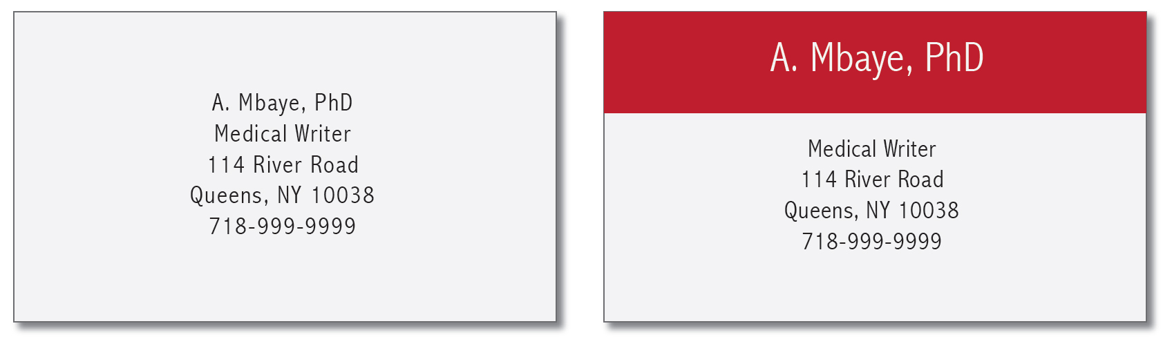
Proximity
Items relating to each other should be placed physically near one another and apart from unrelated Items. Reduce clutter by treating grouped items as one unit. In the two business cards shown here, the one on the left looks cluttered, and items are placed in no particular order. By grouping together the name of the restaurant and the type of food and separating that group from the location information, the card becomes easier to read and more appealing to the eye. Editing the text also helps.

When making design decisions, whether made while writing the text or when the text is completed, consider starting with the proximity idea. Once you know what “bits” of information groups you have, it can be easier to make decisions about contrast, repetition, etc.
Awful & Beautiful
The guides for creating beautiful pages and beautiful lettering have been in the world for centuries. Like all arts, graphic design and typography deserve time devoted to study and practice, but, like hot pepper and salt in a chocolate sauce, just one or two good spices can change the whole dish.
Notice the exploding world of graphic design savvy all around you. Desktop publishing, color printers for home and office, and the ability to upload pages to the Internet have encouraged much experimentation. Some of this is blatantly awful, but there is much that is truly beautiful. You can borrow some of these ideas, as great designers have always done, to design elegant page layouts—whether web pages, business cards, annual reports, agendas, or article proposals—in the service of meaning.
Sources
- Walters Art Museum, Upper Board Inside, Gondarine Sensul, an accordion book from the 17th century ©2011 Walters Art Museum, accessed August 31, 2020. http://purl.thewalters.org/art/36.10/browse.
- Williams, Robin. The Non-Designers Design Book. Berkeley CA: Peachpit Press, 1998, 2008, 2012, 2014.
- Tropical Fish Pseudoanthias squamipinis in Natural Water Habitat, photo by Viridis/iStock.
Notes
- Typefaces used in examples: Abadi, Avenir, Britannic Bold, Daniel, Hot Coffee, Letter Gothic, Fashion Victim, Medieval Scribish, Neuva, Skia, Times New Roman and Tuesday.
- This article was first published in the American Medical Writers Association Journal, Fall 2014. http://www.amwa.org/journal.
PDF Download
Download
© Barbara Kristaponis 2014-2026. The Good Page.

What a great looking website and a big help too.
Amazing things here. I am very glad to look your post. Thanks a
lot and I’m taking a look forward to contact you.
Will you kindly drop me a e-mail?
Gotta love these 19th century buildings.
Thank you for sharing your knowledge and giving us all a refresher. I must, however, with all possible respect, speak to typography: sans serif is hard to read. David Ogilvy taught me that people tend to stop reading from sans serif fatigue. His policy was just to toss it.
Again, thanks for your design lessons.
Margaret, I totally agree with you about Ogilvy’s views on sans serif eye fatigue on long printed texts. But I am learning from my web designer mentors that there are some good reasons to use sans serif for the web. For one review of their logic, have a look at http://www.webdesignerdepot.com/2013/03/serif-vs-sans-the-final-battle/ — although I doubt that this will be the “final” word on the debate.